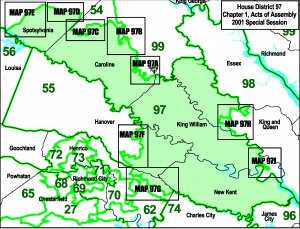
You should really check out Delegate Chris Peace’s (R-97th) campaign website.
I swear that has to be one of the best designed and laid out campaign sites I’ve ever seen. The colors are great too. Ditto for the slideshow, it gets your attention but doesn’t overwhelm you when you’re trying to find something else on the site. It’s one of those things that you look at and say, “Dammit! I wish I could make something like that!”
And when you look at it you don’t realize that it actually uses a self-hosted WordPress installation. I didn’t realize that it did until I saw the standardized URLs for the news updates and I checked out the HTML code and saw the references to WordPress directories. WordPress is great for blogs if you want your site to look like a blog but you usually don’t want your campaign site to look like one. Convenience of WordPress plus a professional design that doesn’t look like a blog? Win.
It’s certainly a far cry from Catherine Crabill’s campaign website which uses a TypePad blog setup. It’s also a far cry from Bobby Orrock’s website that hasn’t been updated in two years. Albert Pollard’s site is okay but noticeably light on content, especially on the “Views” page. Of course, with the person that he’s running against, what does it matter?
And for what someone has told me and what I can find on Peace’s campaign finance disclosures, it didn’t come cheap either. $4,356 for the web hosting and design being paid to PharrOut according to VPAP. It looks like the single most expensive item he’s bought this campaign cycle in fact. Definitely money well spent even though Peace doesn’t have an opponent this year.
